Resi × Pushpay · 2023–2024

One experience.
Three surfaces.

Designing Resi On Demand end-to-end — from the viewing experience itself, to how it lives inside the Church App, to how admins configure it in App Studio. One product. Three audiences. No seams.

My role

UX Designer (UX2)
Sole designer across end-user experience, Church App integration, and App Studio admin configuration

Teams collaborated with

Resi Product & Engineering · App Studio Engineering · Church App team

Surfaces designed

Resi On Demand (end-user) Church App integration App Studio (admin)

Status

Shipped · Live

Surface 01

Resi On Demand

The viewing experience — browsing, playlists, on-demand content for end users (congregants)

Surface 02

Church App

How Resi On Demand is embedded and experienced within the Church App ecosystem

Surface 03

App Studio

How church admins configure, connect, and embed the Resi media library into their app

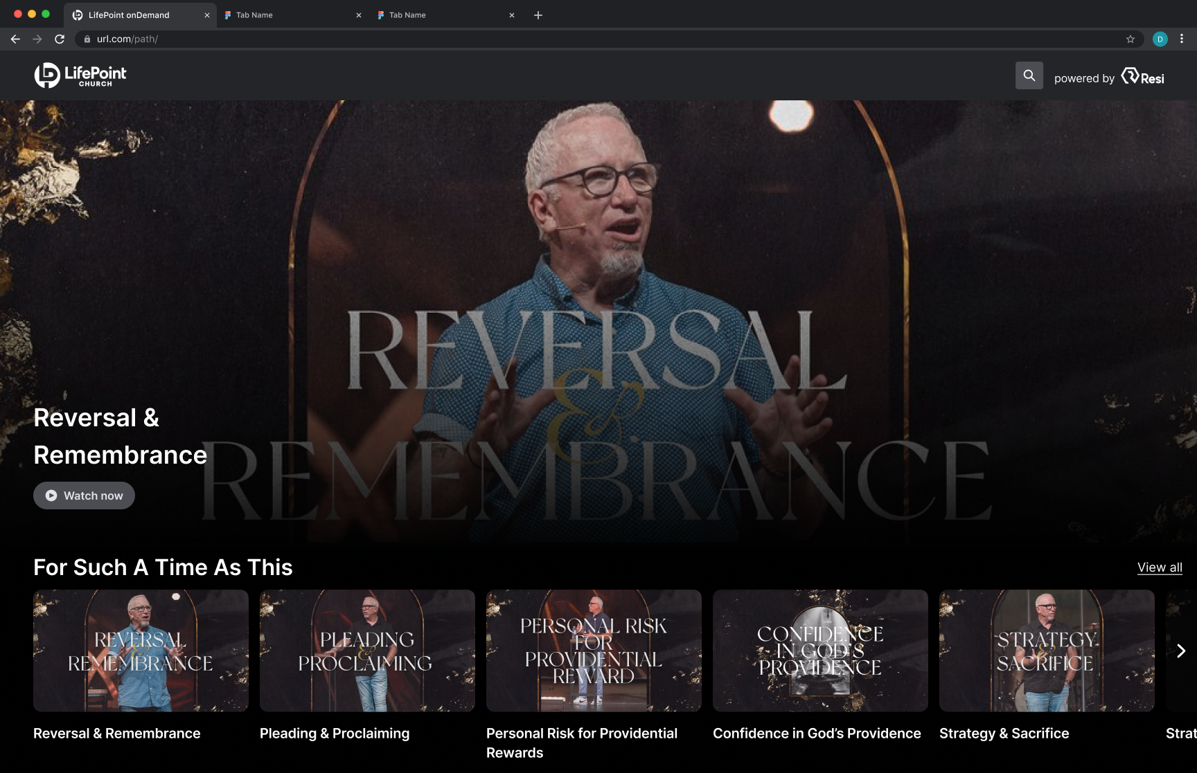
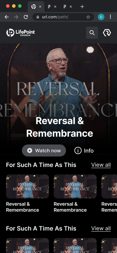
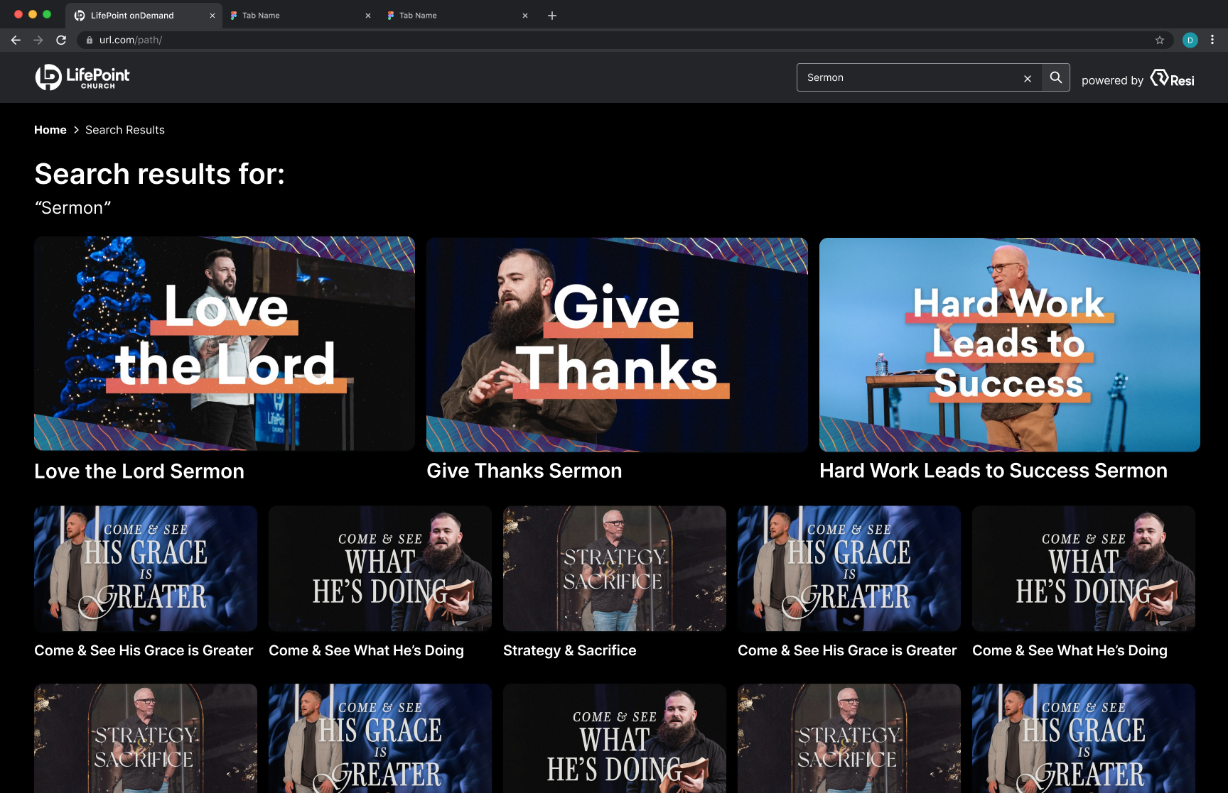
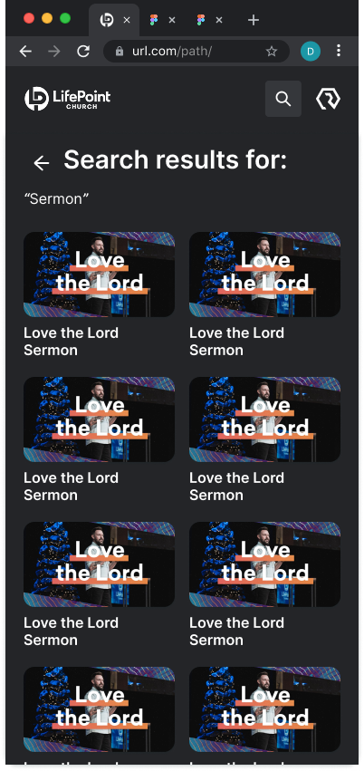
A Netflix-style media library.
Built for the church context.

Resi is Pushpay's live streaming and video product — a separate platform with its own team, design system, and roadmap. The opportunity: an on-demand content experience that let churches offer congregants a branded, distraction-free place to watch past services, sermon series, and media.

The challenge wasn't building a media player. It was designing an experience that felt native across three very different surfaces — a standalone product (Resi On Demand / Media Sites), an embedded feature inside the Church App, and an admin configuration flow inside App Studio.

"No redirects. No competing algorithms. No distractions. One destination where your audience can watch live and explore past content — all in one place."

I was the sole designer on the end-user experience — working directly with the Resi product and engineering team, while continuing my work in App Studio and the Church App.

View Resi On Demand live ↗

Same product.
Three design problems.

Each surface had a different user, context, and definition of success. The design had to work for all three without compromising any of them.

Surface 01 · End user

Resi On Demand

The core viewing experience for congregants. A branded, searchable content library where live streams auto-save and on-demand content is organised into playlists and series. Designed to feel familiar — like a streaming service — while remaining distraction-free and entirely owned by the church.

  • Browse, discover, and watch on-demand content
  • Playlist and series organisation
  • Live + on-demand unified in one destination
  • Branded experience — no third-party interference

Surface 02 · Church App

In-app integration

How Resi On Demand lives inside the Church App. The challenge: integration without the seam showing. Content needed to feel native to the app — not a webview dropped in. Congregants shouldn't feel like they've left the app to watch a video.

  • Seamless embed within Church App navigation
  • Consistent visual language across both products
  • Minimal friction from app to content

Surface 03 · Admin

App Studio config

The admin-facing configuration flow — how church admins connect their Resi account, set up their media library, and embed it. Close collaboration with App Studio engineering kept the flow clear enough for non-technical admins to complete without support.

  • Resi account connection and authentication
  • Media library configuration
  • Embed and publish flow

Working across
two product systems.

Designing across Resi and Pushpay meant navigating two design systems, two engineering teams, and two roadmaps — simultaneously. Every decision had downstream implications across at least two surfaces.

01
Two design systems, one coherent experience. Resi had its own visual language. The Church App had Prism. The integration had to feel native in both without creating a third, undefined aesthetic.
02
Different users, shared content. Admins configure what congregants see. Every admin decision has a direct end-user consequence — which meant designing both sides with that dependency always in mind.
03
Familiar but not generic. The "Netflix-style" reference set expectations. The design needed to feel intuitive — leveraging familiar patterns — without looking like it was just copying a consumer streaming app for a church context.

Resi On Demand, up close.
The end-user surfaces I designed across two products.

Resi sat with its own team, design system, and roadmap. My remit was the end-user side of two surfaces — the standalone Resi On Demand product, and how that experience lived inside the Church App. Five features anchored the work: playlists, live, search, tags, and recommendations.

"What admins curate upstream becomes what congregants browse, search, and play."

Surface 01 — Resi On Demand

Landing built for short attention.

Live takes precedence when active. Playlists and series carry the experience the rest of the time. Recommendations run alongside, tuned for sparse libraries — most churches have hundreds of items, not thousands, so the logic deprioritises freshness in favour of completeness.

home page default.png
Resi On Demand desktop landing page
Resi On Demand · Desktop

Live, playlists, and recommendations on one shelf.

home page default mobile.png
Resi On Demand mobile landing page
Resi On Demand · Mobile

Same hierarchy, restacked for thumb reach.

Surface 01 — Resi On Demand

Search results, not search misses.

Most viewers don't type full titles. Results prioritise partial matches across title, series, and tag. Tags surface near the content, not buried — admin-applied tags become congregant-discoverable filters in the same view.

result page.png
Resi On Demand desktop search results
Resi On Demand · Desktop

Tag filters live alongside results — one view, no extra page.

result page mobile.png
Resi On Demand mobile search results
Resi On Demand · Mobile

Filters fold into the same scroll, not a separate flow.

Surface 02 — Church App

Same content, native shell.

Resi On Demand inside the Church App had to feel native to the app, not like a webview dropped in. Players, controls, and navigation align with the rest of the Church App so congregants don't feel like they've left.

ChurchAppVoD Watching (1).png
Church App Resi VoD watching state
Church App · 01

Resi content, Church App chrome — same household.

ChurchAppVoD Watching (2).png
Church App Resi VoD watching alternate state
Church App · 02

Player + adjacent content laid out for in-app continuity.

Pattern worth noting

Two-sided design discipline.

Every end-user feature has an admin control upstream — a playlist someone built, a tag someone applied, a recommendation rule someone tuned. I designed the visible side, knowing the invisible one shapes every choice. The pattern: design for what the user does, while respecting what the admin needs to be able to do.

Live, branded,
distraction-free.

Resi On Demand shipped as a fully branded, searchable content destination — live and on-demand unified in one place. Churches could offer their congregants a streaming experience they owned entirely, without competing algorithms or third-party interference.

The Church App integration brought that experience into the app congregants already used for giving, groups, and events — making media part of the community experience, not a separate destination.

The App Studio configuration flow gave admins a clear, self-serve path to set up and embed their media library — removing dependency on support for what should be a simple task.

View the live product ↗

Next case study

Unified Ecosystem: Staq Modernisation →