App Studio & Church App · Pushpay · 2022–2024

Building in one product.
Learning the whole ecosystem.

How two years in the most overlooked corner of a SaaS platform became the foundation for everything that came after — including the design system I lead today.

My role

UX Designer (UX1 → UX2)
End-to-end product design, cross-team collaboration, user research advocacy

Teams collaborated with

ChMS · Resi Media · Giving · Engineering (multiple squads)

What shipped

StudioC Integration Events Enhancement Resi on Demand In-App Browser Watch & Respond App UI Refresh
4+
Product teams collaborated with
6
Features shipped to production
2
User types designed for simultaneously
↑DS
Work fed directly into design system strategy

The team everyone
underestimated.

App Studio wasn't the glamorous product squad. Small team, often overlooked, sitting at the intersection of every other product without being fully claimed by any of them.

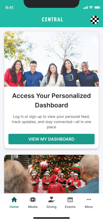
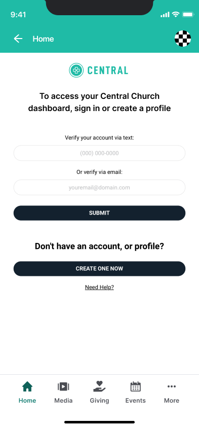
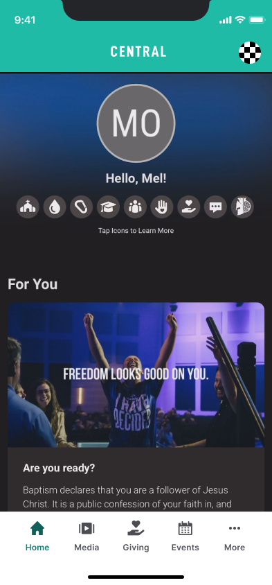
When I joined, end-user knowledge was almost nonexistent. We understood church admins — the people who built the app — but the congregants using it were largely a blind spot. No structured research, limited usability data, and a design system that reflected the problem: hardcoded values, components built in isolation, nothing reusable.

"We were building products for people we barely knew, using tools that didn't talk to each other, in a team that had to earn its seat at every table."

I chose to see it as an opportunity. Being at the edges meant I had to understand everything — Giving, ChMS, Resi, admin and end-user. That forced cross-product literacy became the foundation of how I think about design systems today.

Advocating for the
people we didn't know.

One of the first things I pushed for was end-user focus, not just admin knowledge. I worked closely with Pushpay's UX Research team — advocating for and conducting usability testing, interviews, and synthesis that App Studio hadn't previously prioritised, then sharing it across the wider UX org.

The Church App is where community lives for congregants — events, groups, giving, media, communication. People building a sense of belonging through a digital product. We couldn't design well for them without understanding who they were.

01
Partnered with the UX Research team to bring structured end-user research into App Studio — usability testing, interviews, and synthesis that previously hadn't been applied to this product space.
02
Built a clearer picture of the admin/end-user split — two very different mental models, both living inside the same product ecosystem.
03
Used research findings to shape feature priorities — not just validate designs after decisions were already made.

Selected work.
Every one a collaboration challenge.

Highlights from a broader two-year body of work. Every feature required working across product boundaries — teams with their own roadmaps, constraints, and definitions of "done." That's where the design work actually happened.

01

StudioC Integration

Integrated StudioC's personalisation capabilities into App Studio, giving admins a new layer of control over content and branding. Required deep collaboration with the StudioC team to design an admin experience that didn't feel bolted on.

Collaboration: StudioC (third-party) · App Studio Engineering

02

Events Enhancement

Redesigned the Events experience across App Studio and the Church App to bring parity with ChMS — which owned the events data. Ongoing liaison with the ChMS team ensured admin-side configuration translated cleanly into the app, and congregants could discover, register, and engage with events intuitively.

Collaboration: ChMS team · App Studio Engineering · UX Research

03

Resi on Demand

Two-part story: designing Resi On Demand itself — playlists, video browsing, on-demand experience — and separately how it integrates into the Church App for congregants. Two design challenges, one collaboration across two product teams.

Collaboration: Resi Product & Design · App Studio Engineering

Full case study ↗

04

App UI Refresh

A visual modernisation of the Church App — the white-label product used by congregants. Not a cosmetic update — it required improving consistency across every surface, addressing years of accumulated design debt, and modernising the end-user product.

Collaboration: App Studio Engineering · UX Research

StudioC, up close.
One feature, two user types, three measures of success.

StudioC brings a third-party personalisation model into the Church App. The auth model available at the time meant log-in happens on the church's side — so I designed a pragmatic pattern around that constraint: anonymous content shows by default, with an invitation to log in, not a wall.

"Admin configures it once. Congregant sees it every time they open the app."

User type 01 — Church admins

Configuring StudioC inside App Studio

StudioC slots into the Integrations panel as a new draggable — same authoring model admins already knew. What they set in Home Settings becomes what congregants see. Title, description and CTA are configured once, with a live mobile preview before publish.

User type 02 — Congregants

What congregants see in the Church App

No forced log-in. The invitation sits above consumable content — log in to personalise, or keep reading anonymously.

Home Screen.png
Church App anonymous feed with login invitation card
Congregant · 01

Invitation, not a wall.

Log in.png
Church-configured log-in page
Congregant · 02

Phone or email — church's own profile, not a Pushpay account.

Loggedin.png
Personalised feed after log-in
Congregant · 03

After log-in — the feed personalises. Invitation card drops away.

loggedin-poll.png
Logged-in interactive content including polls
Congregant · 04

Interactive content — polls, media, responses — now available to the known user.

How we measured success

Three axes, three stakeholders

One-sided metrics flatter. Three axes kept us honest.

Admin experience

Setup confidence

Can a church admin configure it without support?

Congregant adoption

Invitation-to-action

Does the soft log-in pattern convert better than a wall?

Product impact

Engagement signal

Does personalised content change behaviour, or just move it?

Pattern worth noting

Why this pattern travels.

A content model where admins configure once and end-users experience the result — anonymous-by-default with a soft invitation — invites progression mechanics: unlocking content as users move through a personalised journey. A direction worth exploring in any content-driven product.

The "overlooked" team
taught me the whole platform.

Working at the intersection of Giving, ChMS, Resi, and the app layer meant developing fluency across the whole Pushpay portfolio. I couldn't design Events without understanding ChMS. I couldn't design media without understanding Resi. I couldn't design giving without understanding the Donor Portal.

That forced breadth is exactly what made me effective when the opportunity came to lead Design System work. You can't build a system for 7 products if you only understand 1.

Cross-product literacy

Deep understanding of how Giving, ChMS, Resi, and Apps intersect — now essential to DS leadership decisions.

End-user research practice

Built from scratch within App Studio — laying groundwork for data-driven design that continues across the UX org.

DS debt identified early

Hardcoded values and siloed components encountered here directly shaped the Staq Modernisation brief — and the atom-level work underway today.

The debt we found then.
The work we're fixing now.

The inconsistencies I encountered in App Studio — hardcoded values, components built in isolation, no shared token architecture — weren't unique to that team. They were systemic.

As Design System Lead, I'm leading an atom-level audit across the full UI library and component library (Storybook). The premise: get the atoms right, and every molecule and organism built on top inherits the improvement — without blocking other teams or creating dependencies.

Claude runs cross-channel audits between Figma, Storybook, and GitHub — surfacing variable mismatches, hardcoded values, and component health, then generating Jira tickets directly from findings. Weeks of manual audit, now hours.

"By working hard on atoms today, any molecules and organisms built by other teams will benefit seamlessly — without us becoming a blocker."

Next case study

Unified Ecosystem: Staq Modernisation →